Capabara
Capabara
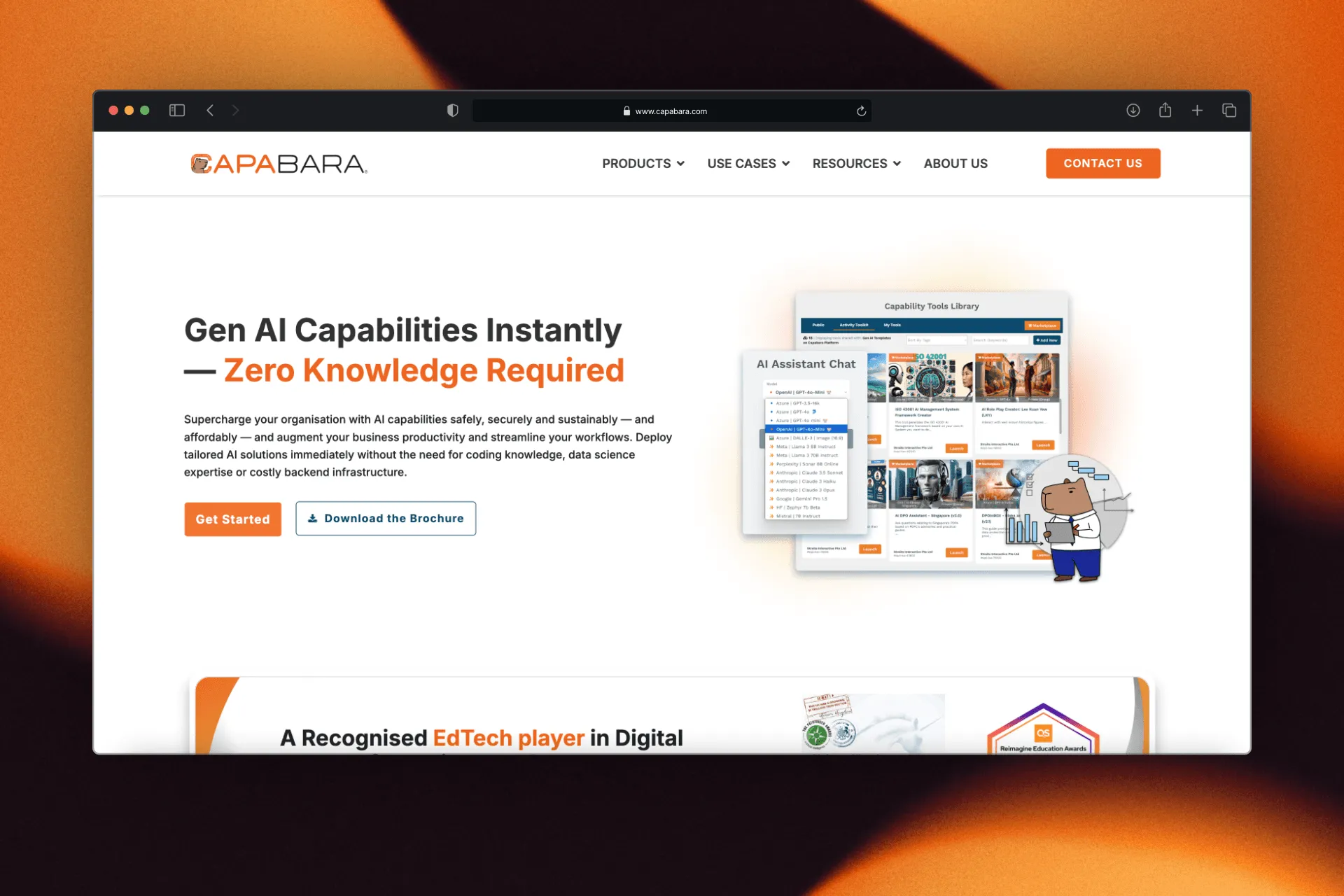
A product website for Capabara, a Generative AI platform by Straits Interactive that helps organisations build, deploy, and govern their own AI tools without writing code.
Project type
Product Website
Project type
Product Website
Role
Web Designer
Role
Web Designer
Focus
UI/UX Design, Web Design, WordPress
Focus
UI/UX Design, Web Design, WordPress
Work Details
The Challenge
Capabara covers a lot of ground: Generative AI, data governance, and digital transformation, each appealing to a different kind of visitor. The challenge was to make a multi-product platform feel immediately clear and approachable, without dumbing it down for the enterprise buyers who needed to trust it.
The Challenge
Capabara covers a lot of ground: Generative AI, data governance, and digital transformation, each appealing to a different kind of visitor. The challenge was to make a multi-product platform feel immediately clear and approachable, without dumbing it down for the enterprise buyers who needed to trust it.
Design Solution
The Challenge
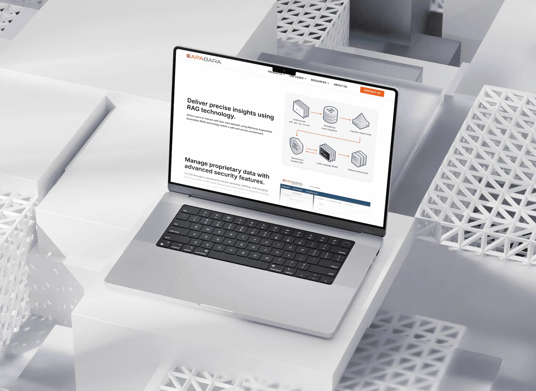
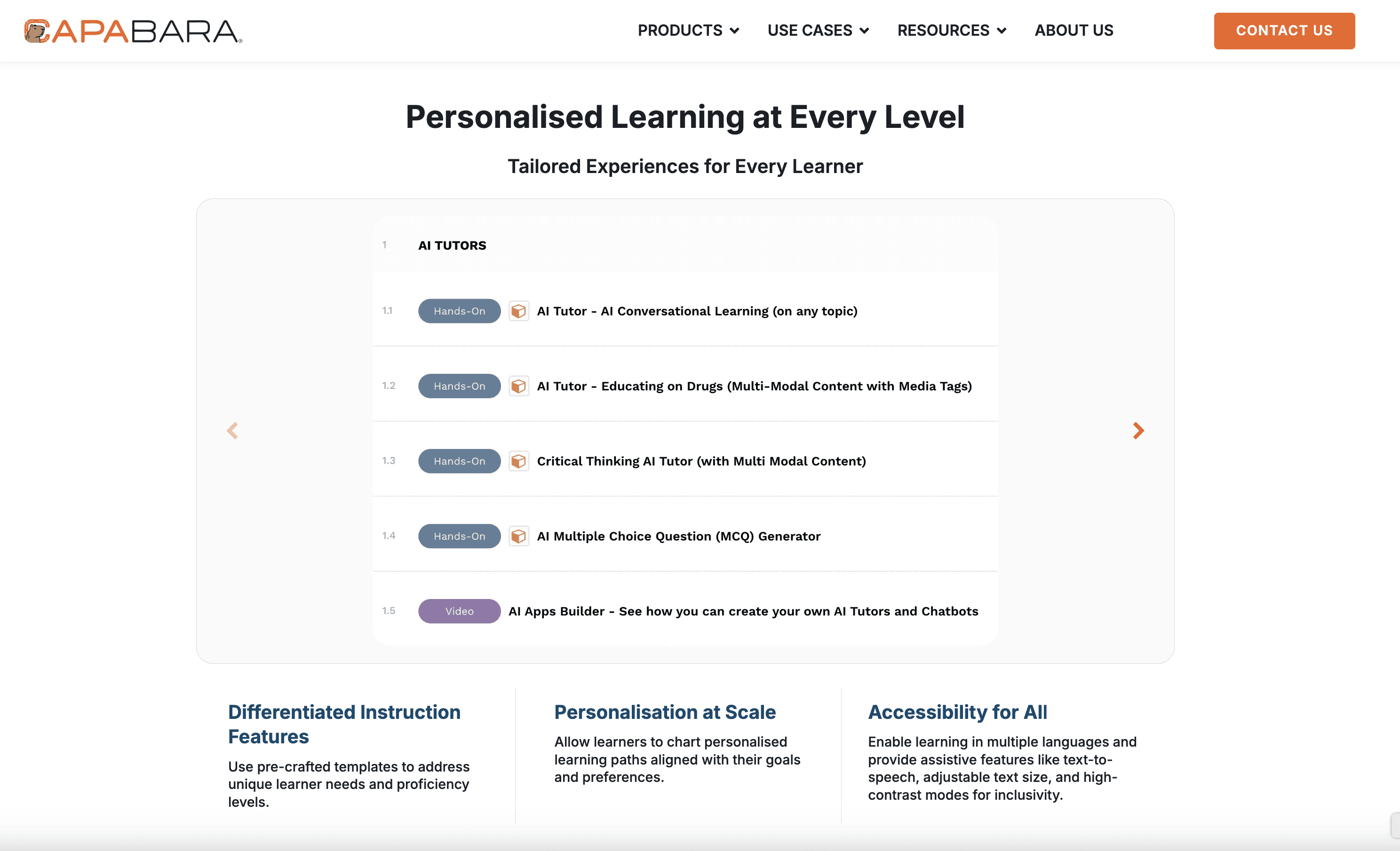
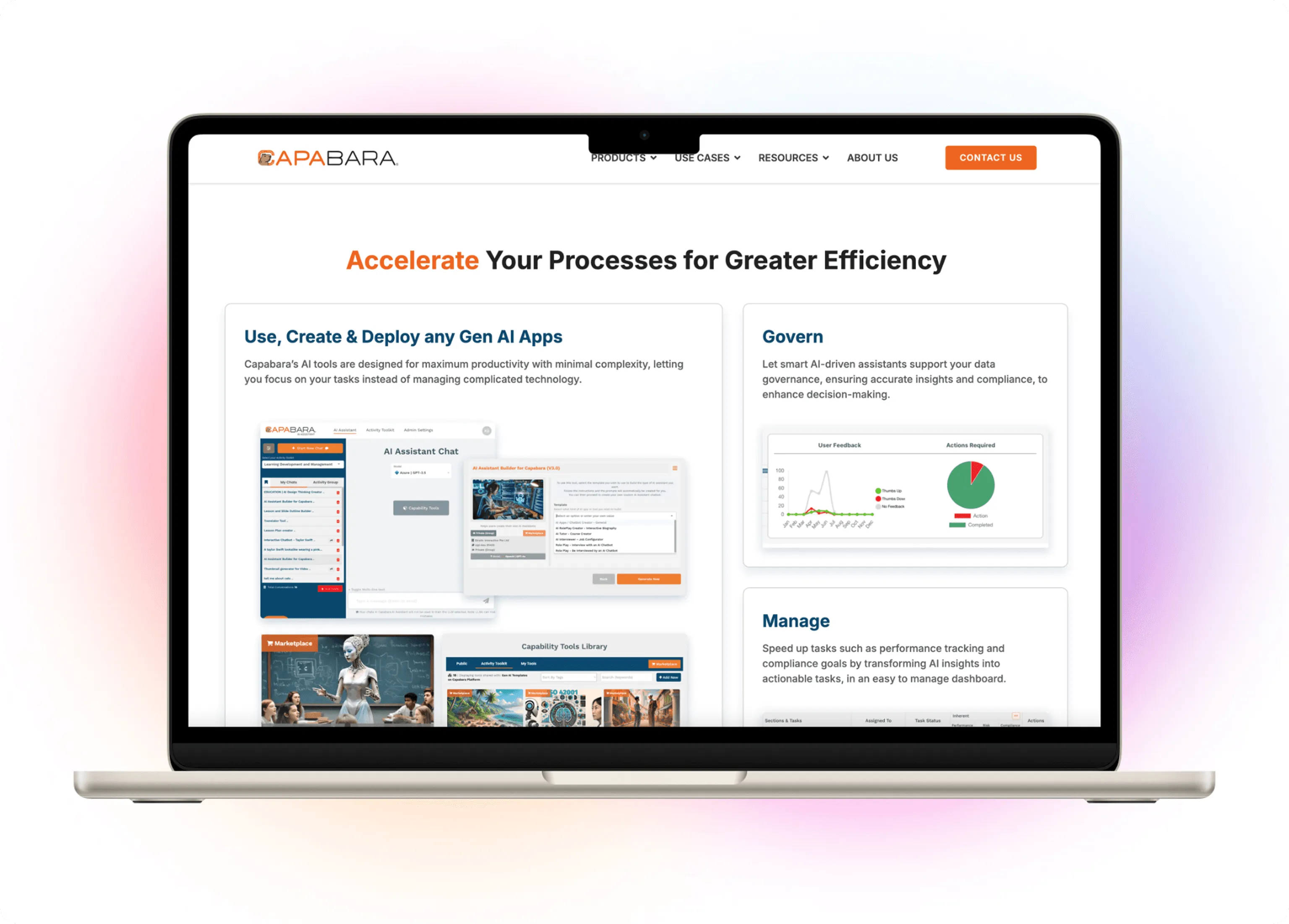
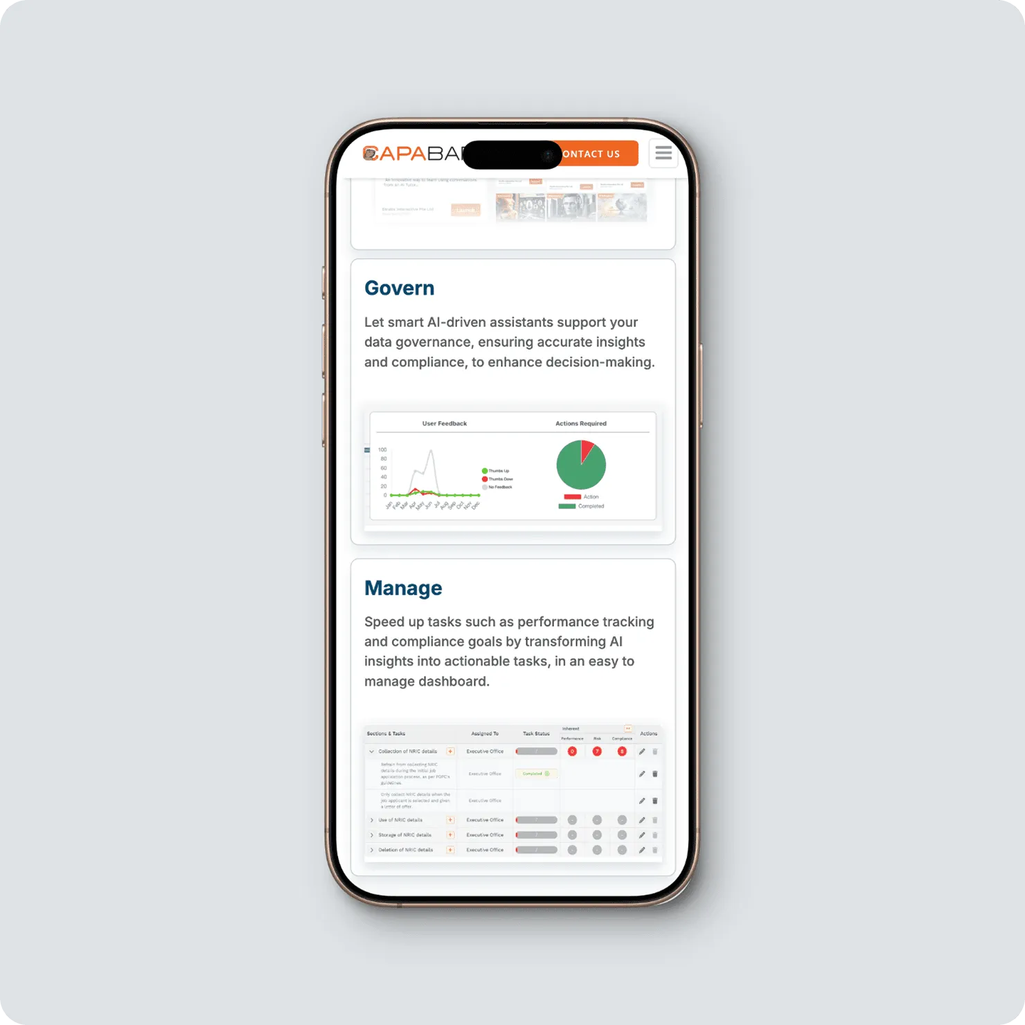
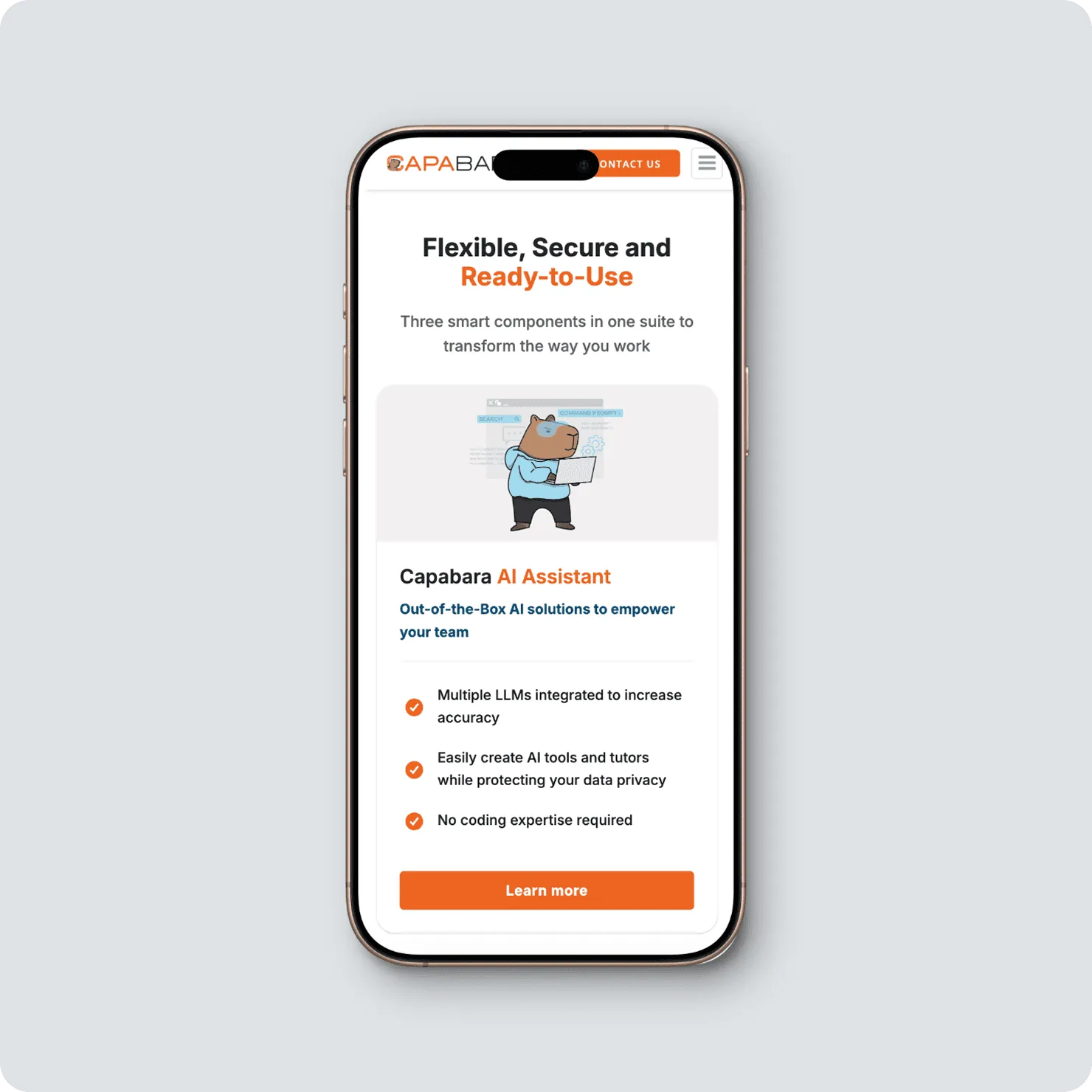
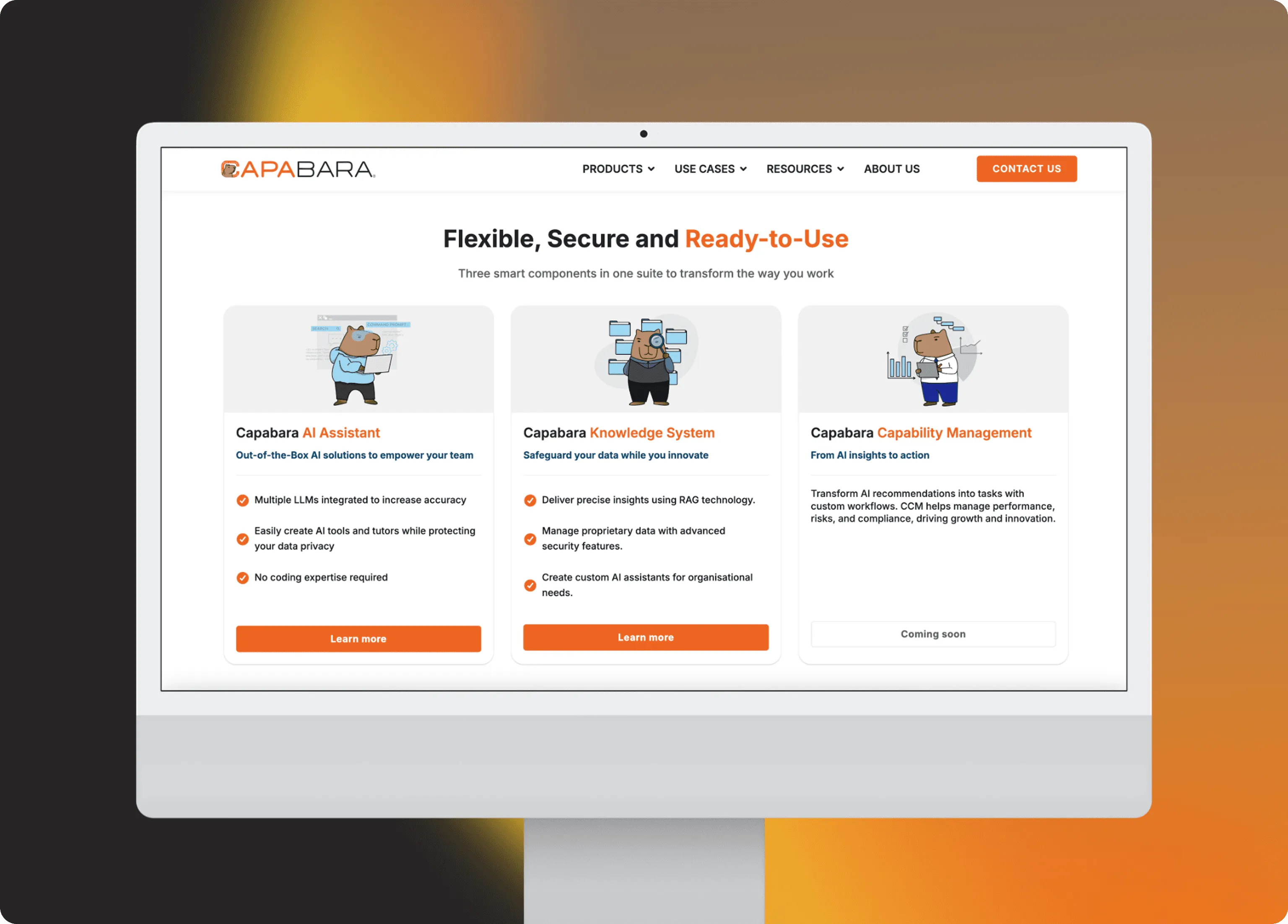
The site is built around three entry points: Products, Use Cases, and Resources, so visitors find their own path quickly. Each page follows a consistent rhythm: plain-language headline, short video, feature breakdown, call to action.
The visual language pairs enterprise credibility with warmth. Orange accents and the capybara mascot keep things human, while generous white space and clear hierarchy do the heavy lifting.
The Challenge
The site is built around three entry points: Products, Use Cases, and Resources, so visitors find their own path quickly. Each page follows a consistent rhythm: plain-language headline, short video, feature breakdown, call to action.
The visual language pairs enterprise credibility with warmth. Orange accents and the capybara mascot keep things human, while generous white space and clear hierarchy do the heavy lifting.
Design Elements
Typography: Bold sans-serif headlines paired with a readable body face for long-form explanations and case studies.
Colour Palette: Capabara orange as the action colour, anchored by deep navy and neutral greys for credibility.
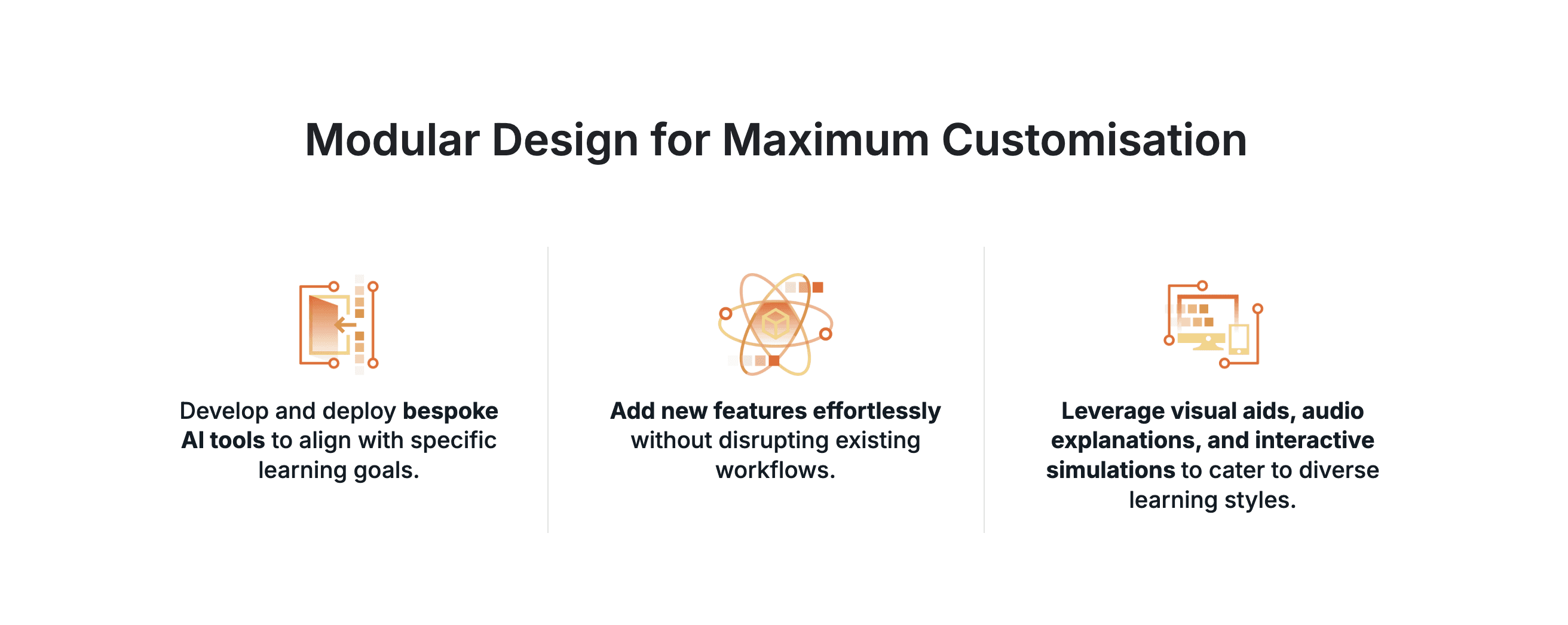
Layout: Modular section blocks that scale across product, use case, and resource pages, giving the team a flexible system to expand into.
Information Hierarchy: Headline first, supporting visual second, detail third. Every section earns the visitor's scroll before asking for it.
Conversion Flow: Repeating "Request a Demo" and "Contact Us" anchors throughout, sized to invite rather than interrupt.
Design Elements
Typography: Bold sans-serif headlines paired with a readable body face for long-form explanations and case studies.
Colour Palette: Capabara orange as the action colour, anchored by deep navy and neutral greys for credibility.
Layout: Modular section blocks that scale across product, use case, and resource pages, giving the team a flexible system to expand into.
Information Hierarchy: Headline first, supporting visual second, detail third. Every section earns the visitor's scroll before asking for it.
Conversion Flow: Repeating "Request a Demo" and "Contact Us" anchors throughout, sized to invite rather than interrupt.
Reflection
Reflection
The hardest part wasn't visual; it was deciding what not to show. B2B design is largely editorial, and this project sharpened that instinct. The component system built for launch has since grown to absorb new products and tools without breaking, which is the best outcome a design foundation can have.
The hardest part wasn't visual; it was deciding what not to show. B2B design is largely editorial, and this project sharpened that instinct. The component system built for launch has since grown to absorb new products and tools without breaking, which is the best outcome a design foundation can have.
"Good design in B2B isn't about saying everything. It's about saying the right thing first."
"Good design in B2B isn't about saying everything. It's about saying the right thing first."